
1. The first impression of your wedding and engagement rings happens online
The search for a wedding or engagement ring rarely starts in the shop these days. In most cases it starts online. Couples browse at home, compare jewellers, look at collections and pick up inspiration long before setting foot in a shop.
A first impression forms within minutes. Not only of the collection, but above all of the jeweller behind it. Is the choice wide enough? Does the website convey craftsmanship? And does this feel like a place where we would be helped personally?
At PrismaNote we see this every day. We work with hundreds of jewellers and receive weekly questions about presenting wedding and engagement rings online. Not because their range is lacking, but because many jewellers wonder how to use their website to generate more shop visits. Because that question keeps coming back, this article shares the patterns we see again and again in practice.
Online, couples usually don't choose a wedding ring yet
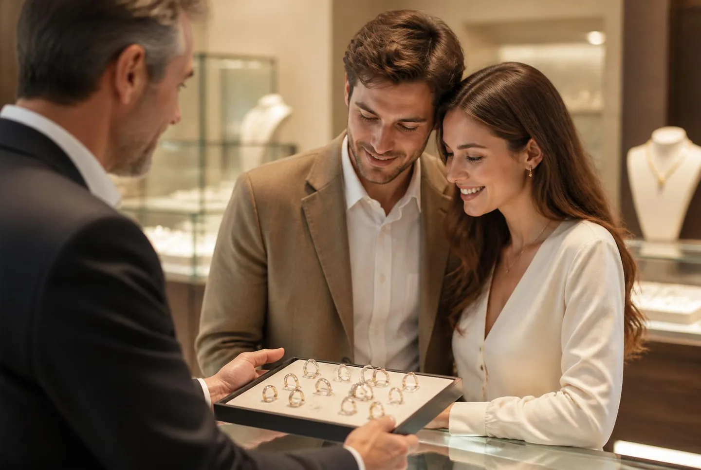
A striking pattern: during their online research couples usually don't pick a wedding ring at all. The final decision tends to happen in the shop. That's where different models are tried on, materials compared, and questions answered about comfort, finish, engravings and custom work.
Online, something else happens. During that first phase couples are mainly deciding which jeweller they trust enough to book an appointment with.
That insight changes the role of your website. The goal isn't to sell a ring online, but to convince visitors that your shop is the right place to make that final choice.
Your website is the first introduction to your shop
Your website is therefore much more than an online catalogue. It's often the first encounter with your shop. Where you tell the story behind a collection in person, answer questions and show options, your website has to do the same without any personal guidance.
Visitors decide themselves which pages they view, how long they take and what matters to them. That is exactly why a clear structure, inspiring content and professional presentation matter so much — for example through a jeweller website connected to your live stock.
Sell more than the ring — sell your craftsmanship too
Many websites mainly show products. That is understandable, but for wedding rings it is often not enough. Visitors don't just want to know what a ring looks like. They want to understand which style suits them, which materials are possible and why a particular collection is special.
Trust in the jeweller matters just as much. Photos of your shop or workshop, stories about craftsmanship, examples of custom work and experiences of other couples show that visitors aren't just browsing a collection — they're arriving at a specialist who will guide them through one of the biggest purchases of their lives.
The first impression sets up the next step
When a website conveys trust, the desire to see the collection in real life follows naturally. That is where the next phase of the decision process begins. Not online, but in the shop.
So the main job of your website is not to sell wedding rings directly. It has to make couples think: "This is the jeweller where we want to choose our wedding rings."
That is really the first decision made online. The choice of the ring itself typically comes later.
2. The best page layout and site structure to bring couples into your shop
When couples don't pick a wedding ring online but a jeweller first, the structure of your website suddenly becomes much more important. Visitors want quick answers to questions like: Does this style suit us? Does this jeweller have enough choice? Can we get personal advice here?
The faster your website answers those questions, the higher the chance a visitor keeps browsing and eventually books an appointment.
Build your website around the customer journey, not your range
Many jeweller websites are logically organised around the business. Navigation is built from brands, collections and product categories. That is tidy for someone who already knows the range, but less so for a couple who is still exploring.
Visitors don't think in brands. They think in questions.
- Which style suits us?
- What is the difference between white gold, yellow gold and platinum?
- Which wedding rings fit our budget?
- Where can we view and try this collection?
When you build your website around these questions, it aligns much better with how couples actually research online.
Make your homepage a starting point, not a destination
The homepage doesn't have to contain everything. Its main job is to guide visitors quickly to the right information. Think of the homepage as a road map. Not every visitor is at the same stage of the decision process.
Some are just looking for inspiration. Others want to jump straight to a specific collection or book an appointment. A well-designed homepage guides visitors step by step, for example along three clear routes:
- Inspiration — discover different styles, materials and trends.
- Collections — browse brands, models and options.
- Book an appointment — schedule personal advice in the shop.
That way visitors never have to think twice about the next step.
A collection page should help choose, not just display
On many websites a collection page is mostly a grid of wedding rings. That is a missed opportunity.
A visitor viewing a collection mainly wants to understand why this collection is interesting. What is the feel? Which type of couple is it right for? Which materials and finishes are possible? And what sets this collection apart from other brands?
Adding that context turns a collection page from a digital catalogue into a decision-support tool. Which increases the chance visitors decide to see the collection in your shop.
Guide visitors step by step
Not every visitor is ready for the same amount of information. Some want to explore different styles first. Others dive straight into materials, prices or specific models. A layered site structure fits that behaviour better. In practice the following layout works well:
- Inspiration pages that show different styles and options.
- Collection pages that explain the character of a brand or collection.
- Product pages where visitors view individual wedding rings and can easily book an appointment.
Each page has its own role, but they all serve the same goal: giving visitors enough confidence to take the next step.
Let every page contribute to a shop visit
When couples mainly choose a jeweller online, no single page is an endpoint. An inspiration page leads to a collection. A collection page leads to a product. And a product page leads to an appointment in the shop.
That's why the option to contact you or book an appointment doesn't belong only on the contact page. The moment a visitor gets excited about a collection or a model, the next step should be right there.
A good site structure guides visitors not just through your range, but through their own decision process. And the more natural that route feels, the higher the chance online research turns into a real conversation in your shop.
3. Which wedding rings do you show online?
When couples mainly choose a jeweller online rather than a specific wedding ring, the role of your online collection changes fundamentally.
The question is no longer: what do you have in stock? But: do couples recognise themselves in what you show?
In practice, most websites still work as a product list, while the best-performing sites work as an inspiration and decision-support tool.
At PrismaNote we work with hundreds of jewellers who present wedding rings online in very different ways. What stands out is that the difference in results doesn't really come from more traffic, but from how complete and contextual the online collection is — often powered directly from your jewellery webshop or online showcase.
Case study: from product list to inspiration collection
Working with a group of jewellers, we studied what happens when the online presentation of wedding rings shifts from a limited product view to a full collection approach.
Situation before the change
Originally the online presentation was often limited or fragmented. In some cases mostly individual products were shown; in others hardly any explicit collections or styles were visible online at all.
Visitors had to find their way through the range themselves and received little context about style, materials and options. In this phase the website mainly functioned as an information point, not as part of the decision process.
The adjustment to the online presentation
The optimisation was built around one principle: help couples choose a jeweller, not a product. Three structural changes were made:
- wedding rings without direct stock stayed visible as inspiration;
- full supplier collections were made available online;
- on collections and rings the step to an appointment was integrated directly, instead of a buy-now flow.
As a result the website became less of a catalogue and more of a first step in the advice process.
Effect on visitor behaviour
After the change we saw clear shifts in online visitor behaviour:
- +24% more appointment clicks
- +40% longer session duration
- +37% more wedding rings viewed per session
An important note: the starting point wasn't a fully developed collection or style presentation everywhere. In some cases the online presentation was rather limited or product-focused. The measured growth therefore mainly shows what happens when the online collection shifts from "showing what we have" to "supporting the choice".
Interpreting the results
The results don't show a direct product optimisation, but a shift in behaviour within the research phase. Visitors stay longer in exploration, look at more styles and are more likely to book an appointment. The website moves from being a sales channel to being the starting point of the advice process in the shop.
3.1 In-stock products remain important as a reference
Rings physically present in the shop remain important because they make concrete what a couple can expect during their visit. But the value is not only in availability — it is mostly in context:
- style and feel;
- choice of materials;
- finish and detail;
- options for custom work.
3.2 Non-stock models as inspiration and starting point
Many couples don't come in for a specific stock item — they come in because they were inspired by the possibilities.
PrismaNote therefore lets you keep wedding rings visible online even without stock, with a clear status and price on request. Instead of a buy button, the visitor is invited to a next step, such as:
- book an appointment;
- reserve a fitting;
- request advice about this collection.
This keeps models part of the research process, even when they aren't immediately available.
3.3 Supplier collections as the biggest source of inspiration
The greatest inspiration often lives in collections that are not physically in stock, but are available through suppliers. Publishing those collections in full online opens up a much wider picture of what is possible. Couples recognise a style that suits them more quickly, after which a shop visit becomes the logical next step.
It's important to make clear these are example models, where materials, widths, stones and finishes can almost always be adjusted to taste.
The power of a complete online collection
The more complete and contextual the online collection, the higher the chance couples recognise themselves in a style and develop a preference for a specific jeweller. And that is precisely where the tipping point sits: from online research to a shop appointment.
Curious how your own online wedding ring presentation could bring in more appointments? We'll take a no-obligation look at your current setup and share concrete improvements.
4. From online research to a wedding ring appointment
In the previous chapters we saw how couples don't pick a wedding ring online but a jeweller first. Then how the structure of your website supports that decision process and how your online collection is mainly there to show inspiration and possibilities.
When those elements line up, a clear moment appears in the customer journey: the step from online research to a shop visit.
Because however strong your online presentation is, the final choice of a wedding or engagement ring is almost never made online. That happens in the shop, where couples can try rings, compare materials and get personal advice. The website plays a different role: not to sell, but to lead to that moment.
The website as a link in the decision process
Couples go through a recognisable process during their research. They discover styles online, dive into collections and slowly form preferences. Not in the form of one specific ring, but in the direction of a certain style or feel.
At that moment there is no buying decision yet, but a clear need: we want to see and experience this in real life.
This is exactly where your website comes in. Not to accelerate a purchase, but to make the step to the shop as logical and low-threshold as possible.
Make the step to the shop part of every page
A common situation is that contact is only available from the contact page. But in practice the need for an appointment arises much earlier — often while looking at a collection or a specific model.
So the step to the shop should return in multiple places, for example:
- on collection pages for wedding and engagement rings;
- on inspiration segments or styles;
- and on individual rings.
Those are the moments when interest peaks. And that is exactly where the next step must be visible and simple. Instead of a generic contact button, tying the action to the context works better:
- Book an appointment to see this collection
- Try these wedding rings in our shop
- Reserve time for personal advice
That way the step to the shop isn't a separate action but a logical continuation of what the visitor is already doing.
Appointment buttons as an extension of your advice
For wedding rings an appointment isn't a conversion point in marketing terms. It is the beginning of the advice process. Couples aren't looking for a quick transaction, but for guidance on a choice that often has lifelong impact.
That's why it works better to position an appointment not as "get in touch", but as part of the advice: you're not coming to buy a ring, you're coming to find the right ring together. The clearer that is, the smaller the threshold to book.
Reducing uncertainty increases shop visits
Many couples postpone their visit to a jeweller because of practical uncertainty. When can we come by? How long does an appointment take? Do we need to prepare anything? Is there parking?
These aren't major doubts, but small hurdles that can delay action. So it helps to place this information not only on the contact page, but also where interest arises. Especially on collection and inspiration pages. The less uncertainty, the faster the step to the shop is taken.
WhatsApp and contact as a first step in trust
Not every visitor is ready to book an appointment right away. It often starts with a small question about a collection, material or availability. For example: "Can you also make this ring in yellow gold?"
For those questions a low-threshold contact channel like WhatsApp is effective. It lowers the barrier to reach out and often becomes the start of a journey that ends with a shop visit. A jeweller chatbot that answers questions 24/7 can play a supporting role here.
What matters is that this contact moment isn't disconnected from the goal, but always points to the same next step: an appointment in the shop.
Reviews as the final confirmation
In the last phase of research couples often look for one more confirmation. Not about the product itself, but about the experience: what is the advice like, how well do they think along, and what does a visit to the shop feel like?
Reviews from other couples play an important role here. Especially when they cover the process itself — the fitting, the advice and the guidance — they strengthen the confidence to actually book.
The best websites don't push sales — they push appointments
When you look at the whole customer journey, one thing becomes clear. Your website isn't the endpoint of the sales process, but the beginning of the advice process.
The most successful jewellers therefore don't try to sell wedding rings online. They make sure couples confidently choose their shop as the place to make the final decision. Every page, every product and every call-to-action ideally contributes to that: from first inspiration to booking an appointment.
5. Conclusion
Looking at the full customer journey, one insight stands out:
Couples usually don't pick a wedding ring online. They first choose a jeweller they trust to make the final decision with.
That fundamentally changes the role of your website. Your website is not a digital showroom and not a webshop. It is the first moment where a couple decides whether they feel at ease with your shop and whether they want to take the step towards an appointment.
A strong online presentation therefore isn't about showing as many wedding rings as possible. It's about three things:
- building trust in your shop and craftsmanship;
- giving insight into your collections and options;
- and making the step to an appointment as easy and logical as possible.
When those elements come together, a natural movement forms from online research to a visit in the shop. Not because the website convinces someone to buy, but because it makes clear:
"This is a jeweller where we want to choose our wedding rings."
And that is where the real decision starts for most couples.